Showing posts with label HTML. Show all posts

CSS Inspired HTML Diya

Leave a Comment
Preview of CSS Inspired Diya
Today i am very happy to introduce you to Diya. Diya is Earthen lamp made with Clay and Pot used in India to lighten up the House. But i am going to make it with more eco-friendly, just using 'HTML & CSS'.

Lets first know about Diya. Diya is used to lighten up the homes and in decoration at Deepawali (Diwali). Diya Base is made with clay or some other earthen material and some oil is used as fuel. Oil is poured into Diya and then string of cotton is put into it and ignited using sparks from matchsticks.

Here in our Eco-friendly Diya we have used HTML. For base of Diya we have .shape and .bati for showing string structure. Flame is made with .loe using Radial Gradient.
.main-div is used proper positioning of all structures.

Here is HTML for Diya

<div class="main-div">
    <div class="loe"></div>
    <div class="bati"></div>
    <div class="semci"></div>
    <div class="shape"></div>
</div>

Don't forgot to Reset your browser CSS before use.

And CSS for Our Eco-friendly Diya

.main-div{
padding-left:33%;
}
.main-div div{
position:relative;
display:block;
}
.shape{
width: 50px;
height:50px;
border-left: 50px solid transparent;
border-right: 50px solid transparent;
border-top: 50px solid #662f05;
top:-11px;
z-index:10;
}
.semci{
width:147px;
height:25px;
background:-webkit-radial-gradient(#eceaed,#662f05);
background:-moz-radial-gradient(#eceaed,#662f05);
background:-o-radial-gradient(#eceaed,#662f05);
background:radial-gradient(#eceaed,#662f05);
-moz-border-radius: 100px / 50px;
-webkit-border-radius: 100px / 50px;
border-radius: 100px / 33px;
border:2px solid #662f05;
z-index:11;
}
.bati{
width: 0;
height: 0;
border-top: 10px solid #fff;
border-right: 3px solid transparent;
bottom:-26px;
left:75px;
z-index:12;
}
.loe{
width:20px;
height:110px;
background:-webkit-radial-gradient(#fcf9fc 10%,#f0dd0c,#e3ab03,#e3ab03);
background:-moz-radial-gradient(#fcf9fc 10%,#f0dd0c,#e3ab03,#e3ab03);
background:-o-radial-gradient(#fcf9fc 10%,#f0dd0c,#e3ab03,#e3ab03);
background:radial-gradient(#fcf9fc 10%,#f0dd0c,#e3ab03,#e3ab03);
border-radius:50%;
border:2px solid #e3ab03;
bottom:-28px;
left:65px;
z-index:13;
}

Here Gradient is used which makes it browser dependent. So for better visualisation try it on Latest versions of Google Chrome and Mozilla Firefox.

How did I get Inspired to design CSS Diya

I got inspiration for this from day to day work.
Read More...

Business Card Style Author Box with HTML & CSS for Bloggers

Leave a Comment
Author Box Preview

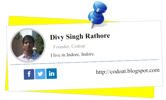
Let's have look at our new Author Box style which i am sharing with you. This author box style look's like Business Card or V-Card. In these author box , Name of Author with profile pic and Bio is given. At bottom it have links of his social networks and his website.

CSS of Author Box Style

.clear{
clear:both;
}
.authorprdprt{
width:500px;
height:250px;
border:1px solid #ccc;
background:yellow;
margin:100px auto;
transform:rotate(3deg)
}
.authorprd{
width: 500px;
height:200px;
border: 1px solid #ccc;
background:#FFF;
padding: 10px;
transform: rotate(-5deg);
margin: 70px;
position: relative;
top: -60px;
left: -70px;
}
.authorprd .pinboard{
background:url(pin.png) no-repeat;
background-size:contain;
width:100px;
height:100px;
position:absolute;
top:-75px;
right:30%;
}
.authorprd .authprpic img{
width:110px;
border:5px solid #ccc;
border-radius:50%;
transition:ease-in all 0.25s;
}
.authorprd .authprpic img:hover{
transition:ease-in all 0.25s;
border-radius:35%;
}
.authorprd .authprpic, .authorprd .authprbio{
float: left;
}
.authorprd .authprbio{
margin:10px 15px;
}
.authorprd .authprbio h2{
margin:10px 0 0;
}
.authorprd .authprbio p{
margin:0px;
}
.authorprd .authprbio .text-muted{
color: #999999;
padding: 0px;
margin: 10px;
}
.authorprd hr.divider{
margin:0px;
height:1px;
background:#499BEA;
}
.authorprd .sociallinks{
display:block;
float:none;
width:100%;
}
.authorprd .sociallinks ul{
list-style:none;
float: left;
}
.authorprd .sociallinks ul li{
float:left;
}
.authorprd .sociallinks ul li a{
display:inline-block;
width: 35px;
height: 35px;
border-radius: 2px;
font-size: 20px;
color: #ffffff;
text-align: center;
line-height: 35px;
margin-left: 3px;
}
.authorprd .sociallinks ul li.facebook a {
background:#3b5998;
}
.authorprd .sociallinks ul li.twitter a {
background:#55acee;
}
.authorprd .sociallinks ul li.linkedin a {
background:#0077b5;
}
.authorprd .sociallinks ul li a span{

}
.authorprd .sociallinks ul.flt-right{
float:right;
}
.authorprd .sociallinks ul.flt-right li a{
display:inline-block;
width: auto;;
border-radius: 2px;
font-size: 20px;
color: #ffffff;
text-align: center;
line-height: 35px;
margin-left: 3px;
color:#000;
text-decoration:none;
} }

These code just required font icon set such as Font-Awesome(which i have used here). if you are using other font icon set then you have to made some changes in below HTML code which i tell you.
.authorprd .authprpic is class of Author's Profile Picture.
.authorprd .authprbio is class of Author's Bio.
.authorprd .authprbio h2 contains Author's Name.
.authorprd .authprbio p.text-muted contains Author's Designation or Tagline.
.authorprd .authprbio p contains Author's 2 line Bio.
.authorprd .sociallinks ul li contains Author's Link.

HTML of Author Box

<link href="font-awesome.css" rel="stylesheet" type="text/css"/>
<div class="authorprdprt">
<div class="authorprd">
<div class="pinboard"></div>
<div class="authprpic">
<img src="Image Link" alt="Alternate Text"/>
</div>
<div class="authprbio">
<h2>Author's name</h2>
<p class="text-muted">Author's Designation</p>
<p>Authors 2 Line Bio.</p>
</div>
<div class="clear"></div>
<hr class="divider"/>
<div class="sociallinks">
<ul>
<li class="facebook"><a href="Facebook Link"><span class="fa fa-facebook"></span></a></li>
<li class="twitter"><a href="Twitter Link"><span class="fa fa-twitter"></span></a></li>
<li class="linkedin"><a href="Linkedin link"><span class="fa fa-linkedin"></span></a></li>
</ul>
<ul class="flt-right">
<li><a href="Your Website">Your Website</a></li>
</ul>
</div>
</div>
</div>

Replace Code in Red Color with your personal links.
If you have used other font then just first add CSS file of that font and then find and replace these code fa fa-facebook, fa fa-twitter, fa fa-linkedin with your font class corresponding to it. If you have any problem just let me know it.
Read More...

Stylish Author Box with Social Links [HTML and CSS]

Leave a Comment
Image Text Author Box

If your are blogger then you should have author box at below your every blog post. Here is Stylish author box which you can use. In this author box you can give credit to author, with his profile pic, social links and bio.
Preview of Stylish author Box
Preview on Profile Pic Hover Preview on Social Link Hover

CSS for Author Box

.author-box{
max-width:700px;
width:75%;
}
.author-box div.author-img, .author-box div.author-content{
display:inline-block;
float:left;
}
.author-box div.author-content{
margin-left:10px;
}
.author-box div.author-img img{
width:150px;
height:150px;
filter:grayscale(1);
-webkit-filter:grayscale(1);
border-radius:50%;
}
.author-box div.author-img img:hover{
width:150px;
height:150px;
-webkit-filter:grayscale(0);
filter:grayscale(0);
}
.author-box div.author-content h2{
line-height:10px;
font-size:30px;
}
.author-box div.author-content div.social-links ul{
padding:0px;
}
.author-box div.author-content div.social-links ul li{
list-style:none;
float:left;
display:inline-block;
color:#fff;
border-radius:70px;
margin:2px;
}
.author-box div.author-content div.social-links ul li:hover,.author-box div.author-content div.social-links ul li a:hover{
padding-right:15px;
}
.author-box div.author-content div.social-links ul li.fbl{
background:#6284B5;
}
.author-box div.author-content div.social-links ul li.tw{
background:#38CDFF
}
.author-box div.author-content div.social-links ul li.gp{
background:#EF5A46;
}
.author-box div.author-content div.social-links ul li.ln{
background:#51A7C0;
}
.author-box div.author-content div.social-links ul li.pi{
background:#FC5F64;
}
.author-box div.author-content div.social-links ul li a:hover span{
float:left;
}
.author-box div.author-content div.social-links ul li a span.sl{
display:inline-block;
width:49px;
height:49px;
margin:0px;
outline: none;
position:relative;
float:left;
}
.author-box div.author-content div.social-links ul li a span.sl-facebook{
background:url(facebook.png);}
.author-box div.author-content div.social-links ul li a span.sl-twitter{
background:url(twitter.png);}
.author-box div.author-content div.social-links ul li a span.sl-google-plus{
background:url(googleplus.png);}
.author-box div.author-content div.social-links ul li a span.sl-linkedin{
background:url(linkedin.png);}
.author-box div.author-content div.social-links ul li a span.sl-pinterest{
background:url(pinterest.png);}
.author-box div.author-content div.social-links ul li a span.slt{
display:none;}
.author-box div.author-content div.social-links ul li a:hover span.slt{
display:inline-block;
color:#fff;
font-size:30px;
line-height:45px;
margin-left:5px;
}
@media (max-width:767px) {
.author-box div.author-content div.social-links ul li a span.slt,.author-box div.author-content div.social-links ul li a:hover span.slt{
display:none;
}
.author-box div.author-content div.social-links ul li:hover, .author-box div.author-content div.social-links ul li a:hover{
padding-right:0px;
}
}
@media (max-width:512px) {
.author-box div.author-content h2{
line-height:normal;
font-size:30px;
}
}


Here is Image used for Social Media Icons. You can download or use your own.


HTML Code for Author Box

<div class="author-box">
<div class="author-img">
<img src="Your Image URL" alt="Divy Singh Rathore"/>
</div>
<div class="author-content">
<h2>Divy Singh Rathore.</h2>
<p>I live in Indore, India.<br/>I like to play with HTML, PHP, Javacript, JQeury, CSS.</p>
<div class="social-links">
<ul>
<li class="fbl"><a href="Social Profile Link"><span class="sl sl-facebook"></span><span class="slt">Facebook</span></a></li>
<li class="tw"><a href="Social Profile Link"><span class="sl sl-twitter"></span><span class="slt">Twitter</span></a></li>
<li class="gp"><a href="Social Profile Link"><span class="sl sl-google-plus"></span><span class="slt">Google Plus</span></a></li>
<li class="ln"><a href="Social Profile Link"><span class="sl sl-linkedin"></span><span class="slt">Linkedin</span></a></li>
<li class="pi"><a href="Social Profile Link"><span class="sl sl-pinterest"></span><span class="slt">Pinterest</span></a></li>
</ul>
</div>
</div>
</div>


* Note - Replace 'Your Image URL' with with image url you use. Also replace Social Profile Link with your links. Social Media Icon are Registered Trade mark of their respective owners.
Read More...

Animated Box Shadow

Leave a Comment
Animated Box Shadow in Alternate and Linear Direction

This Tutorial will make Animated Shadow of Box. Shadow of Box is Rotating around its border with Help of Animation & keyframes properties.
Here 2 Style were made. First Box Shadow Rotate in alternate pattern and other rotate in linear pattern.

CSS for Animated Box Shadow


.main{
margin:100px;
}
.main div{
margin:50px;
float:left;
}
.anibsa{
width:100px;
height:100px;
border:1px solid #000;
border-radius:50%;
-webkit-animation:rbsb 5s linear 0s infinite alternate;
animation:rbsb 5s linear 0s infinite alternate;
}
.anibsl{
width:100px;
height:100px;
border:1px solid #000;
border-radius:50%;
-webkit-animation:rbsb 5s linear 0s infinite;
animation:rbsb 5s linear 0s infinite;
}
@keyframes rbsb
{
0% {box-shadow:15px 15px 5px 5px rgba(232,46,14,1);}
20% {box-shadow:0px 15px 5px 5px rgba(232,46,14,1);}
40% {box-shadow:-15px 0px 5px 5px rgba(232,46,14,1);}
50% {box-shadow:-15px -15px 5px 5px rgba(232,46,14,1);}
60% {box-shadow:0px -15px 5px 5px rgba(232,46,14,1);}
80% {box-shadow:15px 0px 5px 5px rgba(232,46,14,1);}
100% {box-shadow:15px 15px 5px 5px rgba(232,46,14,1);}
}
@-webkit-keyframes rbsb /* Safari and Chrome */
{
0% {-webkit-box-shadow:15px 15px 5px 5px rgba(232,46,14,1);}
20% {-webkit-box-shadow:0px 15px 5px 5px rgba(232,46,14,1);}
40% {-webkit-box-shadow:-15px 0px 5px 5px rgba(232,46,14,1);}
50% {-webkit-box-shadow:-15px -15px 5px 5px rgba(232,46,14,1);}
60% {-webkit-box-shadow:0px -15px 5px 5px rgba(232,46,14,1);}
80% {-webkit-box-shadow:15px 0px 5px 5px rgba(232,46,14,1);}
100% {-webkit-box-shadow:15px 15px 5px 5px rgba(232,46,14,1);}
}

HTML Code for Animated Box Shadow

<div class="main">
<!-- Animated Box Shadow Style 1 - Rotating Alternate -->
<div class="anibsa">
</div>
<!-- Animated Box Shadow Style 2 - Rotating Linear -->
<div class="anibsl">
</div>
</div>

Read More...
© 2015 Codoat - Codes for You All Rights Reserved. | Sitemap | Terms & Condition | Privacy Policy